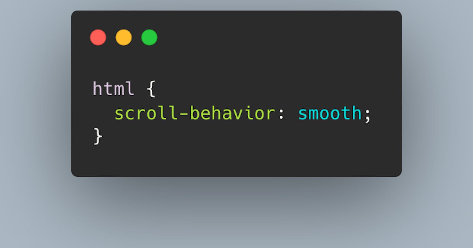
Scroll-Behavior: smooth
A highly underrated CSS feature that adds depth and elegance to your webpage
I've been using #html, #css, and #javascript for at least 3 months now and never came across this beautiful css feature - the smooth scrolling behavior.
What does it do? Well, it allows for href connections inside your webpage that glide INSTEAD OF jump to the destination.
What does it look like? Here's a twitter link to show you.
twitter.com/jacobegood/status/1482206232400..
First, let's set up Section 1 of our mock-up webpage.
    <div class="main" id="section1">
      <div class='div'>
          <a href="#section2">Smooth Scroll <br> DOWN</a>
      </div>
    </div>
Now, we'll duplicate that 3 times for the desired effect... changing section names and the <a href="#target" like this. Each <a> tag needs a different target.
    <div class="main" id="section2">
      <div class='div'>
          <a href="#section3">Smooth Scroll <br> DOWN again</a></div>
    </div>

    <div class="main" id="section3">
        <div class='div'>
            <a href="#section1">Smooth Scroll <br> to the TOP</a>
        </div>
    </div>
Your body should end up like this.
<body>
    <div class="main" id="section1">
      <div class='div'>
          <a href="#section2">Smooth Scroll <br> DOWN</a>
      </div>
    </div>

    <div class="main" id="section2">
      <div class='div'>
          <a href="#section3">Smooth Scroll <br> DOWN again</a></div>
    </div>

    <div class="main" id="section3">
        <div class='div'>
            <a href="#section1">Smooth Scroll <br> to the TOP</a>
        </div>
    </div>

</body>
Now, let's jump into the CSS style sheet. Add this to the top.
html {
  scroll-behavior: smooth;
}
Then, set each section height to 100vh, and find a beautiful picture on unsplash.com to mimic this effect.
#section1 {
    height: 100vh;
    background-image: url('https://images.unsplash.com/photo-1642187388333-52c8edb76d29?ixlib=rb-1.2.1&ixid=MnwxMjA3fDB8MHxwaG90by1wYWdlfHx8fGVufDB8fHx8&auto=format&fit=crop&w=1287&q=80');
    background-size: cover;
    display: flex;
    justify-content: center;
    text-align: center;
    margin: 0;
}
Do the same things for #section2 and #section3. This should be enough for now to get the idea. Don't forget to change the pictures in each!
Finally, set up the #section div tags to look like a button and style the a .div anyway you want. Larger font size and cursor: pointer are always nice.
#section2 div, #section1 div, #section3 div {
    background-color: rgb(255, 255, 255);
    width: 200px;
    height: 60px;
    display: flex;
    align-items: center;
    justify-content: center;
    border-radius: 15px;
}

a, .div{
    text-decoration: none;
    color: black;
    font-size: 1.2rem;
    cursor: pointer;
}
And that's it. Now you're done. Click on the a href tags and you're good to go. Easy peasy. Beautiful.
Enjoy!

